组件插槽
目标:用于实现组件的内容分发,通过 slot 标签,可以接收到写在组件标签内的内容
vue 提供组件插槽能力,允许开发者在封装组件时,把不确定的部分定义为插槽
通过插槽来分配内容
一些情况下我们会希望能和 HTML 元素一样向组件中传递内容:
vue
<AlertBox>
Something bad happened.
</AlertBox>这可以通过 Vue 的自定义 <slot> 元素来实现
vue
<template>
  <div class="alert-box">
    <strong>This is an Error for Demo Purposes</strong>
    <slot />
  </div>
</template>

<style scoped>
.alert-box {
  /* ... */
}
</style>如上所示,我们使用 <slot> 作为一个占位符,父组件传递进来的内容就会渲染在这里。
以上就是目前你需要了解的关于插槽的所有知识了。如果你看完本章节后还想知道更多细节,请深入阅读组件插槽 章节。
案例
插槽例子:
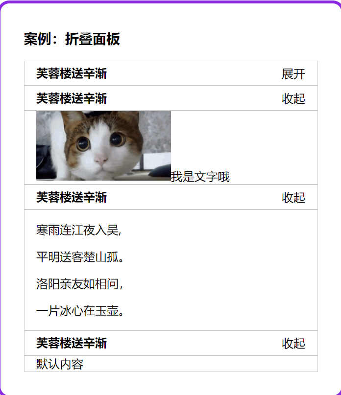
需求:以前折叠面板案例,想要实现不同内容显示,我们把折叠面板里的 Panel 组件,添加组件插槽方式
语法口诀:
- 组件内用
<slot></slot>占位 - 使用组件时
<Panel></Panel>夹着的地方,传入标签替换 slot
Panel.vue - 组件 (直接复制)
vue
<script setup></script>vue
<template>
  <div>
    <!-- 按钮标题 -->
    <div class="title">
      <h4>芙蓉楼送辛渐</h4>
    </div>
    <!-- 下拉内容 -->
    <div class="container">
      <p>寒雨连江夜入吴,</p>
      <p>平明送客楚山孤。</p>
      <p>洛阳亲友如相问,</p>
      <p>一片冰心在玉壶。</p>
    </div>
  </div>
</template>vue
<style scoped>
h3 {
  text-align: center;
}

.title {
  display: flex;
  justify-content: space-between;
  align-items: center;
  border: 1px solid #ccc;
  padding: 0 1em;
}

.title h4 {
  line-height: 2;
  margin: 0;
}

.container {
  border: 1px solid #ccc;
  padding: 0 1em;
}

.btn {
  /* 鼠标改成手的形状 */
  cursor: pointer;
}

img {
  width: 50%;
}
</style>SlotPanel.vue - 组件插槽使用
vue
<script setup></script>

<template>
  <div>
    <div class="title">
      <h4>芙蓉楼送辛渐</h4>
    </div>
    <div class="container">
      <slot>
        <p>寒雨连江夜入吴,</p>
        <p>平明送客楚山孤。</p>
        <p>洛阳亲友如相问,</p>
        <p>一片冰心在玉壶。</p>
      </slot>
    </div>
  </div>
</template>App.vue - 使用组件 (直接复制)
在这个基础重复使用组件
vue
<script setup>
import Panel from "./Panel.vue";
</script>

<template>
  <div id="container">
    <div id="app">
      <h3>案例:折叠面板</h3>

      <Panel>
        <p>寒雨连江夜入吴,</p>
        <p>平明送客楚山孤。</p>
        <p>洛阳亲友如相问,</p>
        <p>一片冰心在玉壶。</p>
      </Panel>

      <Panel></Panel>
    </div>
  </div>
</template>

<style scoped>
#app {
  width: 400px;
  margin: 20px auto;
  background-color: #fff;
  border: 4px solid blueviolet;
  border-radius: 1em;
  box-shadow: 3px 3px 3px rgba(0, 0, 0, 0.5);
  padding: 1em 2em 2em;
}
</style>总结:组件内容分发技术,slot 占位,使用组件时传入替换 slot 位置的标签
插槽默认内容
如果外面不给传,想给个默认显示内容
<slot> 夹着内容默认显示内容,如果不给插槽 slot 传东西,则使用 <slot> 夹着的内容在原地显示
vue
<slot>默认内容</slot>总结:插槽可以自定义标签,作用域插槽可以把组件内的值取出来自定义内容