Matplotlib

Matplotlib 是一个 Python 的 2D 绘图库,通过 Matplotlib ,开发者可以仅需要几行代码,便可以生成折线图,直方图,条形图,饼状图,散点图等。
是专门用于开发 2D 图表 (包括 3D 图表)
以渐进、交互式方式实现数据可视化
基础使用
matplotlib.pyplot 模块包含了一系列类似于 matlab 的画图函数。
pythonimport matplotlib.pyplot as plt创建画布 -- plt.figure()
pythonimport matplotlib.pyplot as plt plt.figure(figsize=(4, 3), dpi=6) # figsize:指定图的长宽 # dpi:图像的清晰度 # 返回 fig 对象绘制图像 --
plt.plot(x, y)显示图像 --
plt.show()
折线图绘制与显示
# 0. 准备数据
x = [1, 2, 3, 4, 5, 6, 7]
y_shanghai = [17, 17, 18, 15, 11, 11, 13]

# 1. 创建画布
plt.figure(figsize=(20, 8), dpi=100)

# 2. 绘制图像
plt.plot(x, y_shanghai)

# 3. 图像显示
plt.show()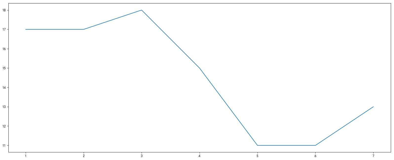
Matplotlib 图像结构 (了解)

添加辅助功能
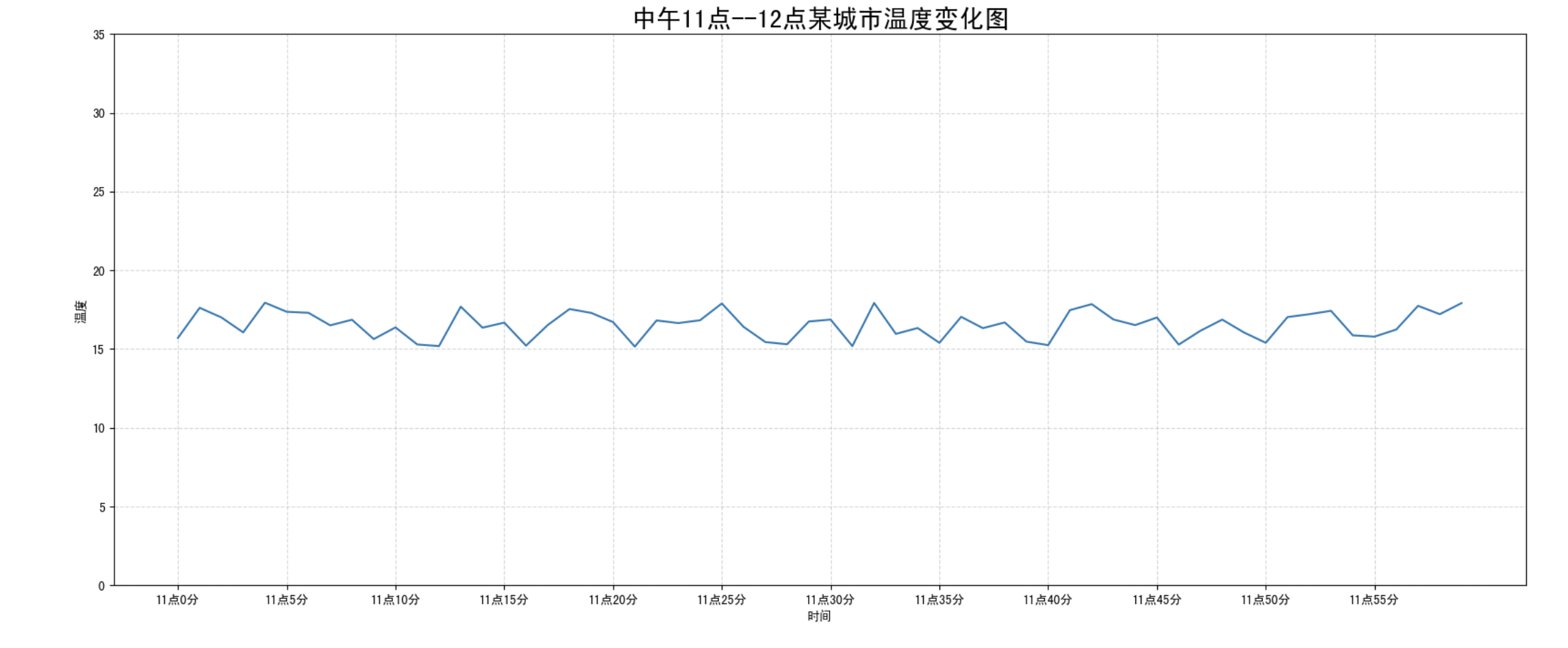
为了更好地理解所有基础绘图功能,我们通过天气温度变化的绘图来融合所有的基础 API 使用
需求:画出某城市 11 点到 12 点 1 小时内每分钟的温度变化折线图,温度范围在 15 度~18 度
效果:
1. 准备数据并画出初始折线图
import matplotlib.pyplot as plt
import random

# 画出温度变化图

# 0. 准备 x, y 坐标的数据
x = range(60)
y_shanghai = [random.uniform(15, 18) for i in x]

# 1. 创建画布
plt.figure(figsize=(20, 8), dpi=80)

# 2. 绘制折线图
plt.plot(x, y_shanghai)

# 3. 显示图像
plt.show()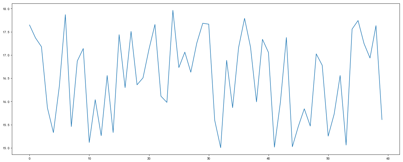
2. 添加自定义 x,y 刻度
# 2.1 添加 x,y 轴刻度
# 设置 x,y 轴刻度
x_ticks_label = ["11 点{}分".format(i) for i in x]
y_ticks = range(40)

# 修改 x,y 轴坐标刻度显示
# plt.xticks(x_ticks_label[::5])
# 坐标刻度不可以直接通过字符串进行修改
plt.xticks(x[::5], x_ticks_label[::5])
plt.yticks(y_ticks[::5])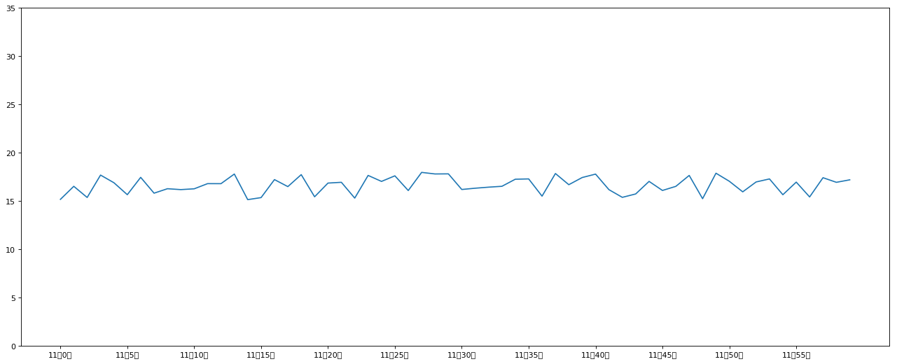
这一步可能会出现中文乱码问题,请查看附录乱码解决方案
3. 添加网格显示
为了更加清楚地观察图形对应的值
# 2.2 添加网格显示
plt.grid(True, linestyle="--", alpha=1)
4. 添加描述信息
添加 x 轴、y 轴描述信息及标题
通过 fontsize 参数可以修改图像中字体的大小
# 2.3 添加描述信息
plt.xlabel("时间")
plt.ylabel("温度")
plt.title("中午 11 点 -12 点某城市温度变化图", fontsize=20)绘制多个图像
多次 plot
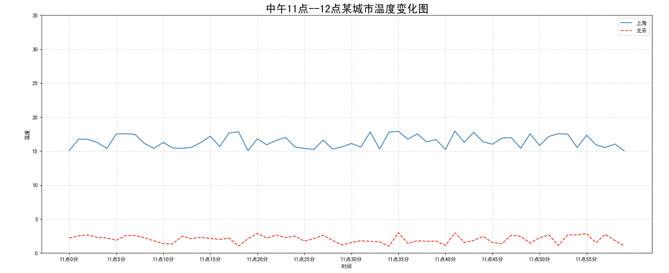
需求:再添加一个城市的温度变化
收集到北京当天温度变化情况,温度在 1 度到 3 度。怎么去添加另一个在同一坐标系当中的不同图形,其实很简单只需要再次 plot 即可 ,但是需要区分线条,如下显示
# 增加北京的温度数据
y_beijing = [random.uniform(1, 3) for i in x]

# 2. 绘制图像
plt.plot(x, y_shanghai, label="上海")
# 新增绘制北京的数据
plt.plot(x, y_beijing, color="r", linestyle="--", label="北京")我们仔细观察,用到了两个新的地方,一个是对于不同的折线展示效果,一个是添加图例。
设置图形风格
| 颜色字符 | 风格字符 |
|---|---|
| r 红色 | - 实线 |
| g 绿色 | - - 虚线 |
| b 蓝色 | -. 点划线 |
| w 白色 | : 点虚线 |
| c 青色 | ' ' 留空、空格 |
| m 洋红 | |
| y 黄色 | |
| k 黑色 |
显示图例
注意:如果只在 plt.plot() 中设置 label 还不能最终显示出图例,还需要通过 plt.legend() 将图例显示出来。
# 绘制折线图
plt.plot(x, y_shanghai, label="上海")
# 使用多次 plot 可以画多个折线
plt.plot(x, y_beijing, color='r', linestyle='--', label="北京")

# 显示图例
plt.legend(loc="best")| Location String | Location Code |
|---|---|
| 'best' | 0 |
| 'upper right' | 1 |
| 'upper left' | 2 |
| 'lower left' | 3 |
| 'lower right' | 4 |
| 'right' | 5 |
| 'center left' | 6 |
| 'center right' | 7 |
| 'lower center' | 8 |
| 'upper center' | 9 |
| 'center' | 10 |
完整代码:
import matplotlib.pyplot as plt
import random

# 0. 准备数据
x = range(60)
y_shanghai = [random.uniform(15, 18) for i in x]
y_beijing = [random.uniform(1, 3) for i in x]

# 1. 创建画布
plt.figure(figsize=(20, 8), dpi=100)

# 2. 绘制图像
plt.plot(x, y_shanghai, label="上海")
plt.plot(x, y_beijing, color="r", linestyle="--", label="北京")

# 2.1 添加 x,y 轴刻度
# 构造 x,y 轴刻度标签
x_ticks_label = ["11 点{}分".format(i) for i in x]
y_ticks = range(40)

# 刻度显示
plt.xticks(x[::5], x_ticks_label[::5])
plt.yticks(y_ticks[::5])

# 2.2 添加网格显示
plt.grid(True, linestyle="--", alpha=0.5)

# 2.3 添加描述信息
plt.xlabel("时间")
plt.ylabel("温度")
plt.title("中午 11 点--12 点某城市温度变化图", fontsize=20)

# 2.4 图像保存
plt.savefig("./test.png")

# 2.5 添加图例
plt.legend(loc=0)

# 3. 图像显示
plt.show()多个坐标系显示
plt.subplots(面向对象的画图方法)
如果我们想要将上海和北京的天气图显示在同一个图的不同坐标系当中,效果如下:
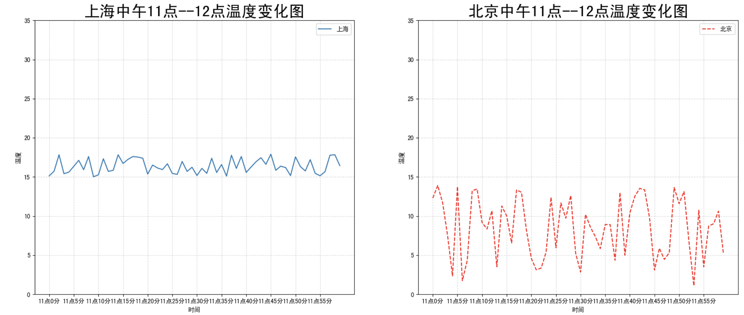
可以通过 subplots 函数实现 (旧的版本中有 subplot,使用起来不方便),推荐 subplots 函数
matplotlib.pyplot.subplots(nrows=1, ncols=1, **fig_kw)创建一个带有多个axes(坐标系/绘图区) 的图Parameters: nrows, ncols : 设置有几行几列坐标系 int, optional, default: 1, Number of rows/columns of the subplot grid. Returns: fig : 图对象 axes : 返回相应数量的坐标系 设置标题等方法不同: set_xticks set_yticks set_xlabel set_ylabel关于 axes 子坐标系的更多方法:参考 https://matplotlib.org/stable/api/axes_api.html
注意:plt. 函数名() 相当于面向过程的画图方法,axes.set_方法名() 相当于面向对象的画图方法。
import matplotlib.pyplot as plt
import random

# 0. 准备数据
x = range(60)
y_shanghai = [random.uniform(15, 18) for i in x]
y_beijing = [random.uniform(1, 5) for i in x]

# 1. 创建画布
# plt.figure(figsize=(20, 8), dpi=100)
fig, axes = plt.subplots(nrows=1, ncols=2, figsize=(20, 8), dpi=100)

# 2. 绘制图像
# plt.plot(x, y_shanghai, label="上海")
# plt.plot(x, y_beijing, color="r", linestyle="--", label="北京")
axes[0].plot(x, y_shanghai, label="上海")
axes[1].plot(x, y_beijing, color="r", linestyle="--", label="北京")

# 2.1 添加 x,y 轴刻度
# 构造 x,y 轴刻度标签
x_ticks_label = ["11 点{}分".format(i) for i in x]
y_ticks = range(40)

# 刻度显示
# plt.xticks(x[::5], x_ticks_label[::5])
# plt.yticks(y_ticks[::5])
axes[0].set_xticks(x[::5])
axes[0].set_yticks(y_ticks[::5])
axes[0].set_xticklabels(x_ticks_label[::5])
axes[1].set_xticks(x[::5])
axes[1].set_yticks(y_ticks[::5])
axes[1].set_xticklabels(x_ticks_label[::5])

# 2.2 添加网格显示
# plt.grid(True, linestyle="--", alpha=0.5)
axes[0].grid(True, linestyle="--", alpha=0.5)
axes[1].grid(True, linestyle="--", alpha=0.5)

# 2.3 添加描述信息
# plt.xlabel("时间")
# plt.ylabel("温度")
# plt.title("中午 11 点--12 点某城市温度变化图", fontsize=20)
axes[0].set_xlabel("时间")
axes[0].set_ylabel("温度")
axes[0].set_title("中午 11 点--12 点某城市温度变化图", fontsize=20)
axes[1].set_xlabel("时间")
axes[1].set_ylabel("温度")
axes[1].set_title("中午 11 点--12 点某城市温度变化图", fontsize=20)

# # 2.4 图像保存
plt.savefig("./test.png")

# # 2.5 添加图例
# plt.legend(loc=0)
axes[0].legend(loc=0)
axes[1].legend(loc=0)

# 3. 图像显示
plt.show()小结
- 添加 x,y 轴刻度【知道】
- plt.xticks()
- plt.yticks()
- 注意:在传递进去的第一个参数必须是数字,不能是字符串,如果是字符串吗,需要进行替换操作
- 添加网格显示【知道】
- plt.grid(linestyle="--", alpha=0.5)
- 添加描述信息【知道】
- plt.xlabel()
- plt.ylabel()
- plt.title()
- 图像保存【知道】
- plt.savefig("路径")
- 多次 plot【了解】
- 直接进行添加就 OK
- 显示图例【知道】
- plt.legend(loc="best")
- 注意:一定要在 plt.plot() 里面设置一个 label,如果不设置,没法显示
- 多个坐标系显示【了解】
- plt.subplots(nrows=, ncols=)
- 折线图的应用【知道】
- 应用于观察数据的变化
- 可是画出一些数学函数图像